
Art of Graph
A community of artists who tell captivating stories through graph data visualization.

Art of Graph readers will recognize Giorgia Lupi and Stefanie Posavec from our October and November newsletters. For one year Lupi, an Italian living in New York, and Posavec, an American in London, worked together on Dear Data. This project comprised a weekly correspondence through hand-drawn postcards that used only visual “languages” to map data relating to an agreed-upon topic.
For example, Week 42, was a “Week of Laughters”. A deep collaboration and friendship emerged as they communicated particulars of daily life in this way.
“Instead of using data just to become more efficient, we argue we can use data to become more humane and to connect with ourselves and others at a deeper level.” - Stefanie & Giorgia
With their award-winning book Dear Data and their latest collaboration Observe! Collect! Draw!, Lupi and Posavec hope to inspire others to draw, slow down and make human connections, and to see the world through a new lens where everything and anything can be a creative starting point for play and expression.
A friendly visualization: Dear Data

A dialogue between four hands:
Giorgia Lupi’s Data Humanism
Giorgia Lupi an information designer and Pentagram partner advocating for Data Humanism, a practice that can, in her words, “transform the abstract and the uncountable into something that can be seen, felt…” One of her projects, “A dialogue between four hands” is a collaboration with multi-instrumentalist Kaki King.
“Instead of focusing on a linear representation of the music, which would have been simply a visualization of the partiture and tabs, I used a different approach: following the repetitive nature of the song, which is clearly structured by sections.”
In creating a visual language for music, she asks “Can we feel data? And can we see music?” Her humanistic, rather than purely mechanistic approach to visualizing the data embodied in a stream of sound is designed to connect with viewers on many levels, and to open neglected channels of communication.
For more examples of how Lupi’s award-winning work in data-driven communication emphasizes empathy and human connection, visit http://giorgialupi.com/.
Distorting geography to show train travels
“When a train starts running from one station to the next station, conceptually, these two stations will temporarily be closer to each other. And that is exactly what this visualization shows: whenever a train moves to the next station — and only for as long as a train is moving — the origin station moves towards the destination station.”
An award-winning Data Experience Designer from The Netherlands, Jan Willem Tulp's portfolio includes collaborations with the likes of Google and the European Space Agency. See more of his work here: https://tulpinteractive.com/
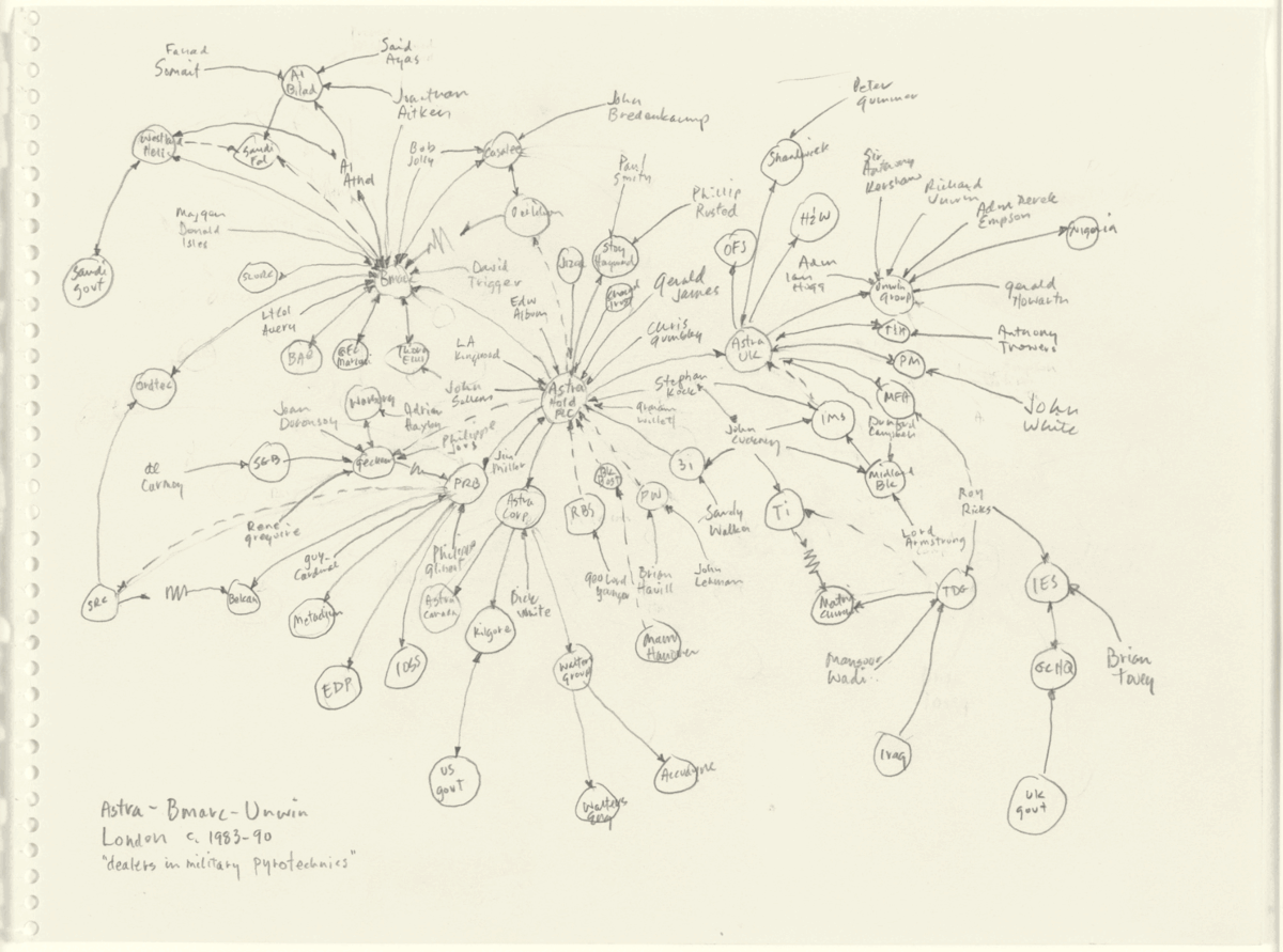
The uses and abuses of power
Graph is often characterized as a technical or niche approach to working with information, but the drawings of Mark Lombardi (1952-2000) remind us how intuitive graphs truly are. While these drawings now hang in museums and private collections, they also played a role in the FBI’s post-9/11 investigations. Per art historian Robert Hobbs:
"On October 17, 2001, five weeks after the terrorist attacks on the World Trade Center...an FBI agent contacted the Whitney Museum of American Art....to obtain a reproduction of Mark Lombardi's large drawing BCCI-ICIC & FAB, 1972-1991 (4th Version)...At about the same time, Lombardi's gallery, Pierogi, also received a telephone inquiry from a 'lead investigator into the September 11th attacks [seeking] information pertaining to wealthy Saudi Arabian terrorist Osama Bin Laden and his Al Qaeda network by tracing his many financial connections...[to] BCCI…"
"If government investigators had merely decided to include select members of the art world in their investigation in the 9/11 attacks, that fact alone would have been newsworthy. But when an F.B.I. agent consulted a work of art for clues pertaining to terrorist financing, she unwittingly made history."

Molecular compounds visualized for drug discovery
Presented at the Spring 2022 American Chemical Society conference, this graph by Google Scientific Advisor Stephen K. Boyer and Kineviz Software Engineer Nikko Sacramento uses publicly available ChEMBL Data to visualize small molecules and their connections to drug patents.
The field of drug discovery is rapidly evolving through the integration of big data, machine learning, and graph analysis. This graph pulls from the ChEMBL EBI Small Molecules Database (via Google BigQuery) to reveal the relationships between chemical compounds, efficacy tests for those compounds, and the diseases that drugs made from those chemicals can cure. The molecular structure is displayed in-graph to provide a more comprehensive picture of not only where but why the chemical compound appears.
Dr. Kirell Benzi is a data artist, science communicator, and researcher who works “to show that algorithms have a soul… and that we can extract emotions from complexity using tools and methods that come straight from scientific research.” He holds a Master of Science in Communication Systems from ECE Paris and a Ph.D. in Data Science from Ecole Polytechnique Fédérale de Lausanne (EPFL).
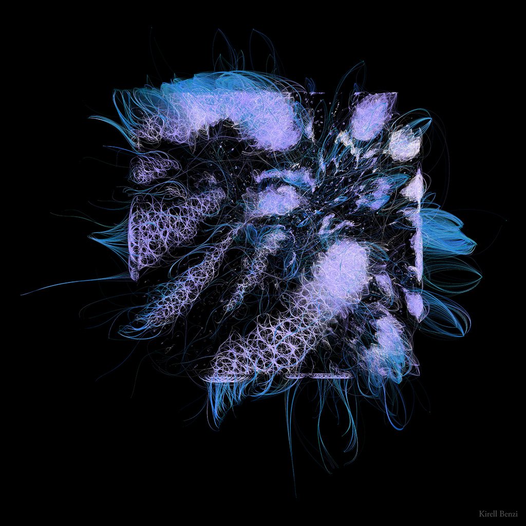
Dr Benzi collaborated with Karius, a life sciences company specializing in genomics and machine learning, to create "Triumph." A testament to the life-saving power of science and technology, Triumph visualizes the connections between patients based on shared microbial markers. Their ages are encoded in the color palette, from bright to dark for young to old. Immunocompromised individuals are represented by nodes falling outside the square. The data behind Triumph comes from Karius’ tests which quickly and non-invasively detect over 1,000 pathogens from a single blood sample.
For more artworks that use real world data to evoke emotional responses and narrate complex stories, visit Dr Benzi’s portfolio at https://www.kirellbenzi.com/art.
Triumph: The art of Dr. Kirell Benzi
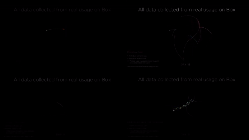
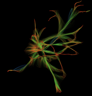
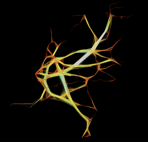
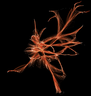
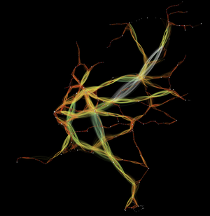
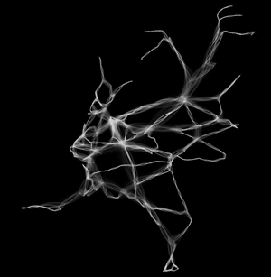
Kinetic visualization and the shape of collaboration
What does collaboration look like? That question led to the creation of these visualizations and to the founding of Kineviz as a spinoff from Kinetech Arts (a non-profit collective exploring the intersection of science, art, and technology). Visualizing file sharing activity over time on the Box cloud platform revealed that different industries take very distinct shapes. In this comparison we can see how software development is tightly entangled while construction features well-separated functional groups. Finance demonstrates clear hierarchy whereas healthcare is only loosely connected. This kinetic visualization (that’s where we get our name!) inspired a series of consulting projects and, eventually, the creation of GraphXR. To see more, visit the Box Collab Graph playlist.