
From Spanner Graph to Operational Insight: Visual Telco Analysis with Kineviz GraphXR
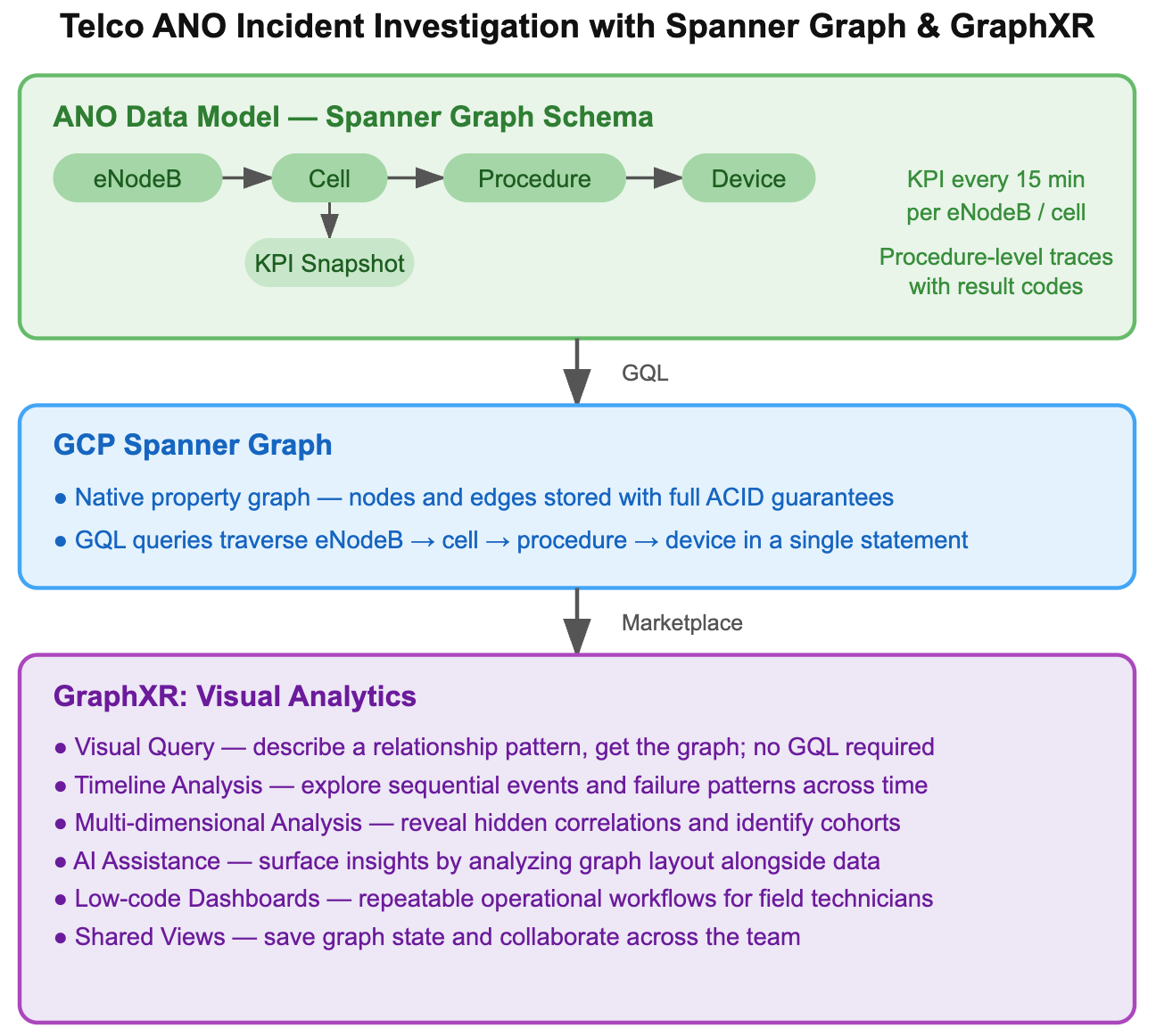
Communication Service Providers (CSPs) are building autonomous networks while tackling the exploding complexity of modern telecommunications. This shift requires more than just automation alone: it demands a responsive human oversight layer paired with a dynamic visualization system that can detect emerging incident patterns, retrieve relevant data, generate intuitive views, and feed insights back into the network.
In this context, we demonstrate how Kineviz GraphXR, an agent-assisted graph visual analytics platform, working with Spanner Graph, enables field operators to monitor incidents and identify root causes more effectively. Within GraphXR, an AI agent collaborates with the analyst by interpreting intent, generating queries, and constructing visualizations, allowing operators to focus on reasoning rather than mechanics.
Effective analysis depends on visualizing relationships within the data. GraphXR provides a no-code, interactive environment where both the analyst and the AI agent operate on the same visual context, iteratively refining the investigation.
Spanner Graph offers an efficient high-performance storage solution for the diverse, multi-layered telecommunications network data. This data spans from low-level individual event logs to time-windowed KPIs and high-level aggregated incidents, supporting both OLTP (Online Transaction Processing) and analytical use cases. Crucially, the platform enables explicit modeling and querying of relationships using GQL, which enables immediate visual analysis in GraphXR.
In practice, field operators often lack GQL expertise, and even correct queries return tabular results that require interpretation. Recognizing patterns — such as a single device causing repeated failures or groups of devices failing together — can be difficult.
An analyst–agent co-reasoning approach addresses this gap. The agent surfaces patterns and generates visual structures, while the analyst validates and guides the process. Insight emerges through this iterative process, enabling faster and more intuitive root cause analysis.
The data behind the alerts
We use data from the Google Telco Autonomous Network Data Demo. It is organized into three layers:
Event logs: Detailed records of what happens during individual network procedures, such as when a phone tries to connect to the network. Each record shows the steps taken during the connection process, the result of each step, and the session involved. These logs contain the fine-grained signals that can indicate when something has gone wrong.
Aggregated KPI snapshots: Every 15 minutes, the network aggregates key performance indicators (KPIs) for each base station (eNodeB) and its cells, including eRAB success rate, RRC connection attempts, retainability, and uplink signal strength. When any metric falls below a predefined threshold, an alert is triggered.
Among these, the eRAB success rate is a primary indicator of the health of a Long-Term Evolution (LTE) network, measuring the percentage of successful data session setups. While typically above 99%, sustained drops across consecutive intervals signal an incident that requires investigation.
Incidents: An incident is triggered when failures persist over time or begin to affect neighboring cells. At this point, the issue is no longer just a single anomaly but a network problem that requires investigation.
We ported the ANO data from BigQuery into Spanner Graph. (BigQuery Graph, just released for public preview, also supports this workflow). From the Cloud Marketplace we connected SpannerGraph to GraphXR.
What the graph shows you
Investigators recognize that the investigative process is iterative, involving both answering established questions and uncovering new ones. Visualizing query results as a graph supports this process by illuminating insights and guiding subsequent steps.
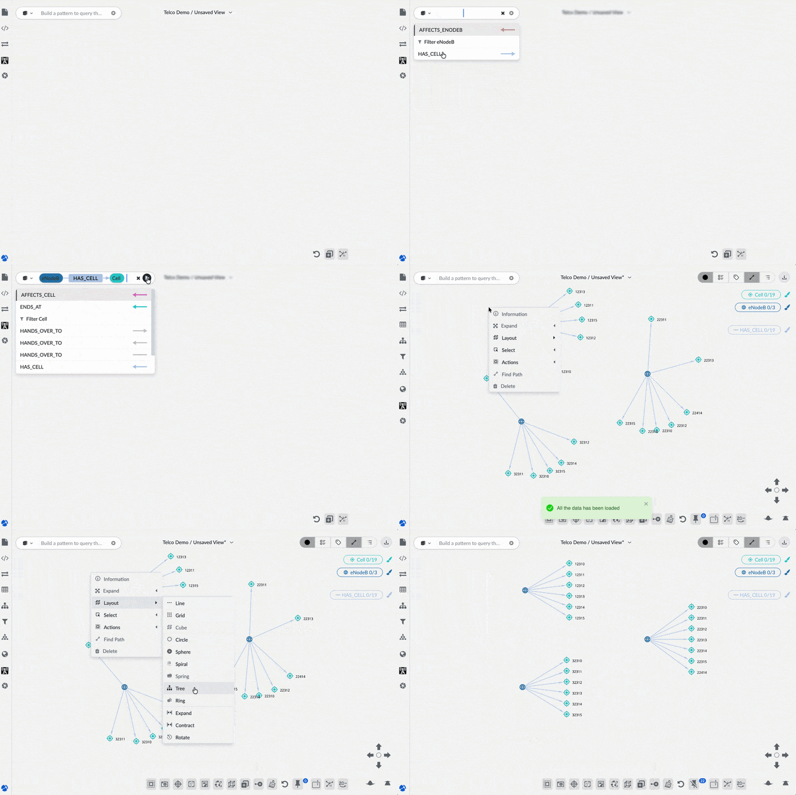
Initial no-code query and graph visualization of base stations and their connected cells
In the GraphXR search bar, we entered the no-code point-and-click graph query:
(:eNodeB) — [:HAS_CELL] -> (:Cell)
This pulls in the base station (eNodeB) nodes and their connected Cells as a connected graph.
To better visualize the hierarchical structure, we can right-click and apply a Tree layout to the graph.
Incident analysis
The Google Automated Network Operations (ANO) demonstration features a component called an “incident detector agent.” This agent is designed to automatically monitor two important performance metrics, or Key Performance Indicators (KPIs), to detect problems in the telecom network:
- eRAB success rate: This measures how often the network successfully sets up a connection for a user. The agent flags an issue if this rate drops below 97%.
- Active eRAB release rate: This measures how frequently active connections are being dropped or disconnected. The agent flags an issue if this rate goes above 3 times per hour.
For the purpose of this study, each incident groups the flagged KPIs for each cell over time. We created a simple Grovebook, GraphXR’s built-in low-code notebook and dashboard, to list incidents in the data set, together with the associated starting, ending time, cell ID, and number of associated KPISnapshots. This lets a user select an incident and load the relevant data into GraphXR.
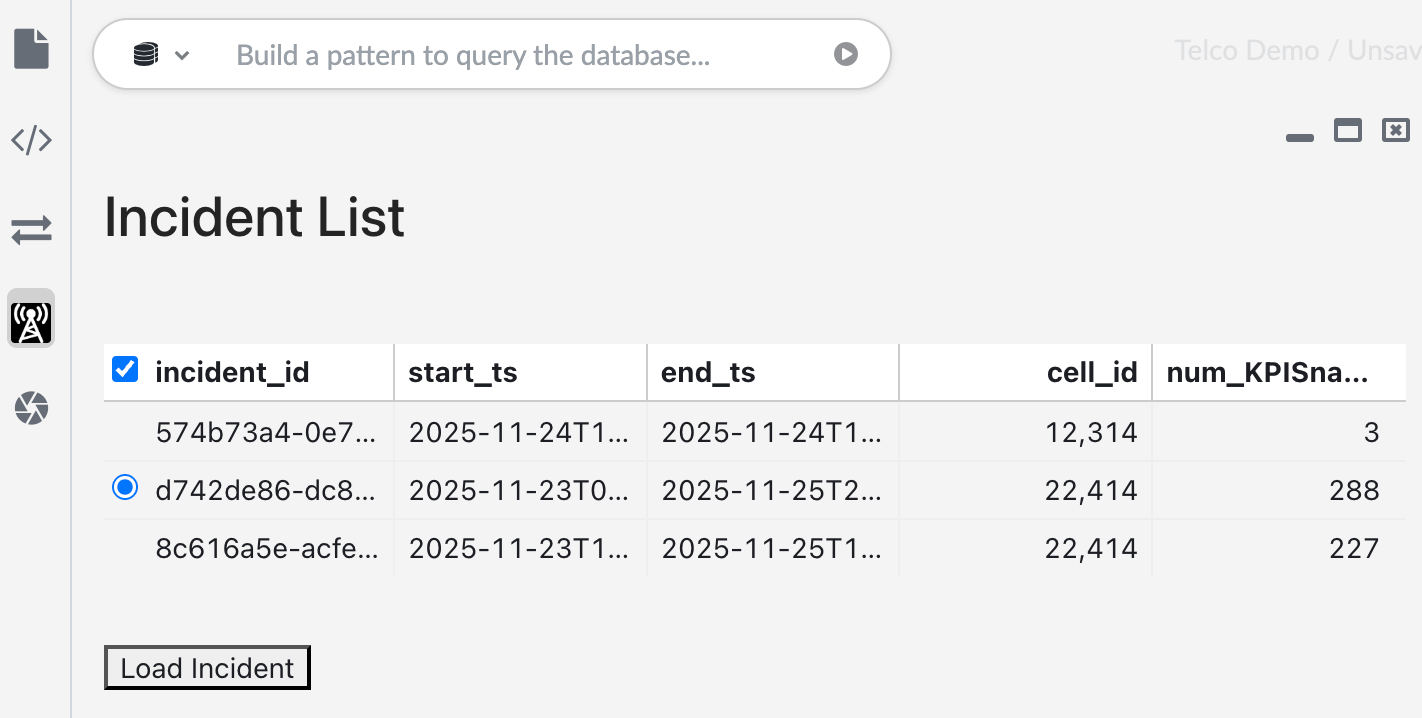
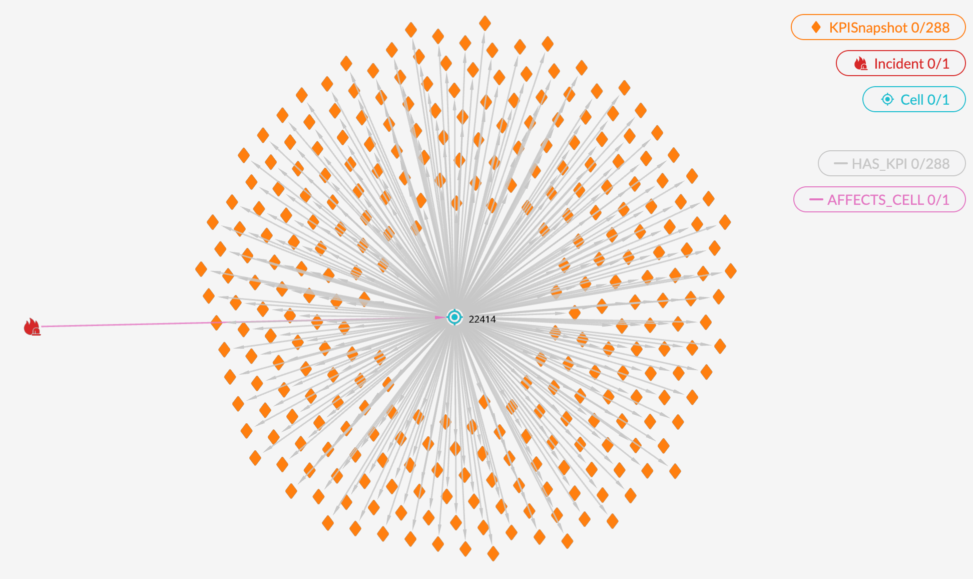
Clicking on the Load Incident button dynamically generates the following GQL query using the selected incident_id, sends the query to Spanner Graph, and returns the graph.
MATCH (i:Incident)-[a:AFFECTS_CELL]->(c:Cell)-[h:HAS_KPI]->(k:KPISnapshot)
WHERE i.incident_id = '${id}'
AND k.measurement_end >= i.start_ts
AND k.measurement_end <= i.end_ts
AND k.erab_success_rate < 97.0
return *
The incident, the affected cells and their KPI snapshots now appear together as a connected graph.
Visualizing KPIs over time.
From the dashboard, we loaded the KPI snapshots associated with the selected incident and plotted them with time on the x-axis and eRAB success rate on the y-axis. Nodes are scaled in size according to connection volume.
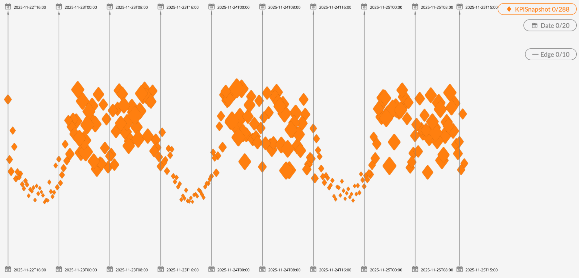
A daily rhythm shows up immediately: high-volume connections during the day and lower-volume connections during the evening.
The y-axis showing the eRAB success rate revealed something unexpected: the worst success rates were during quiet hours, when volume was lowest.
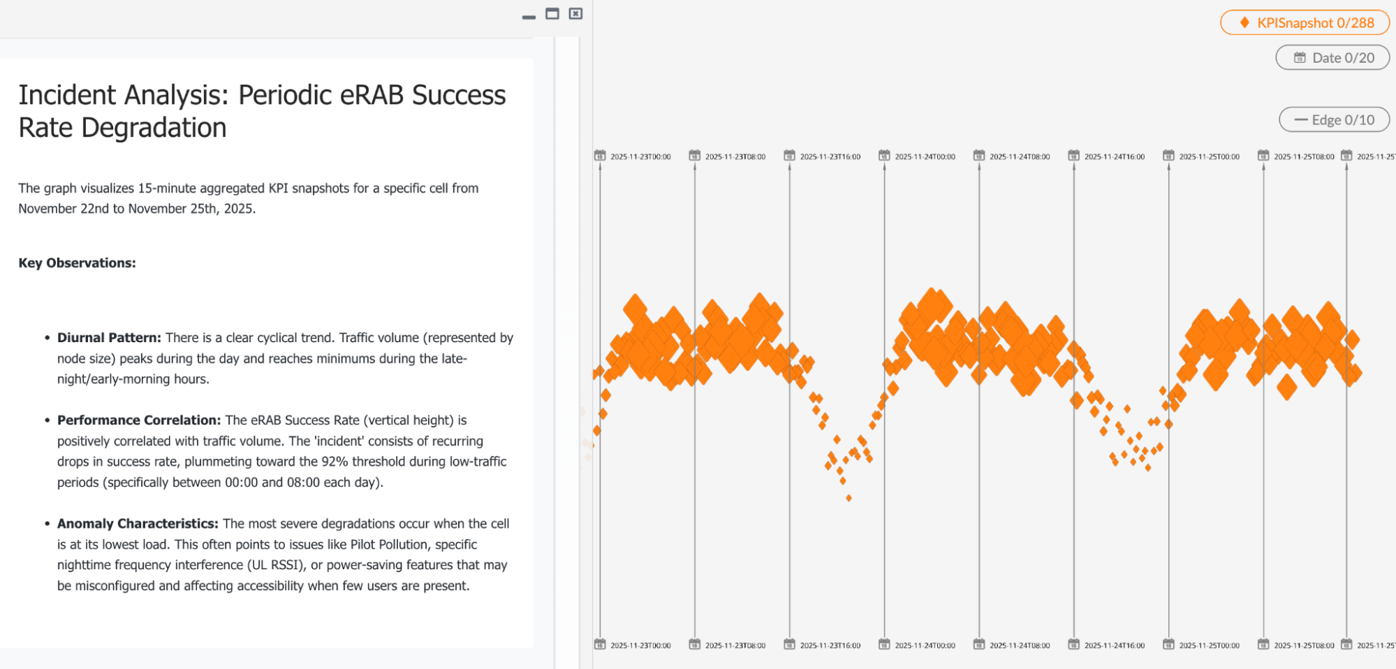
GraphXR includes an agent that understands both the database schema and the analysis workflow. Using a natural language input, it can generate Grovebooks directly from a description of the task. For example, you might say, “show all failed security procedures by device.” Grove will create an interface element — such as a button — that runs the query, applies the layout, and presents the result. The agent can also examine the visual pattern together with the data in the graph, and perform assessment, as shown in this screen capture.
Plotting KPI properties to explore correlation in 3D
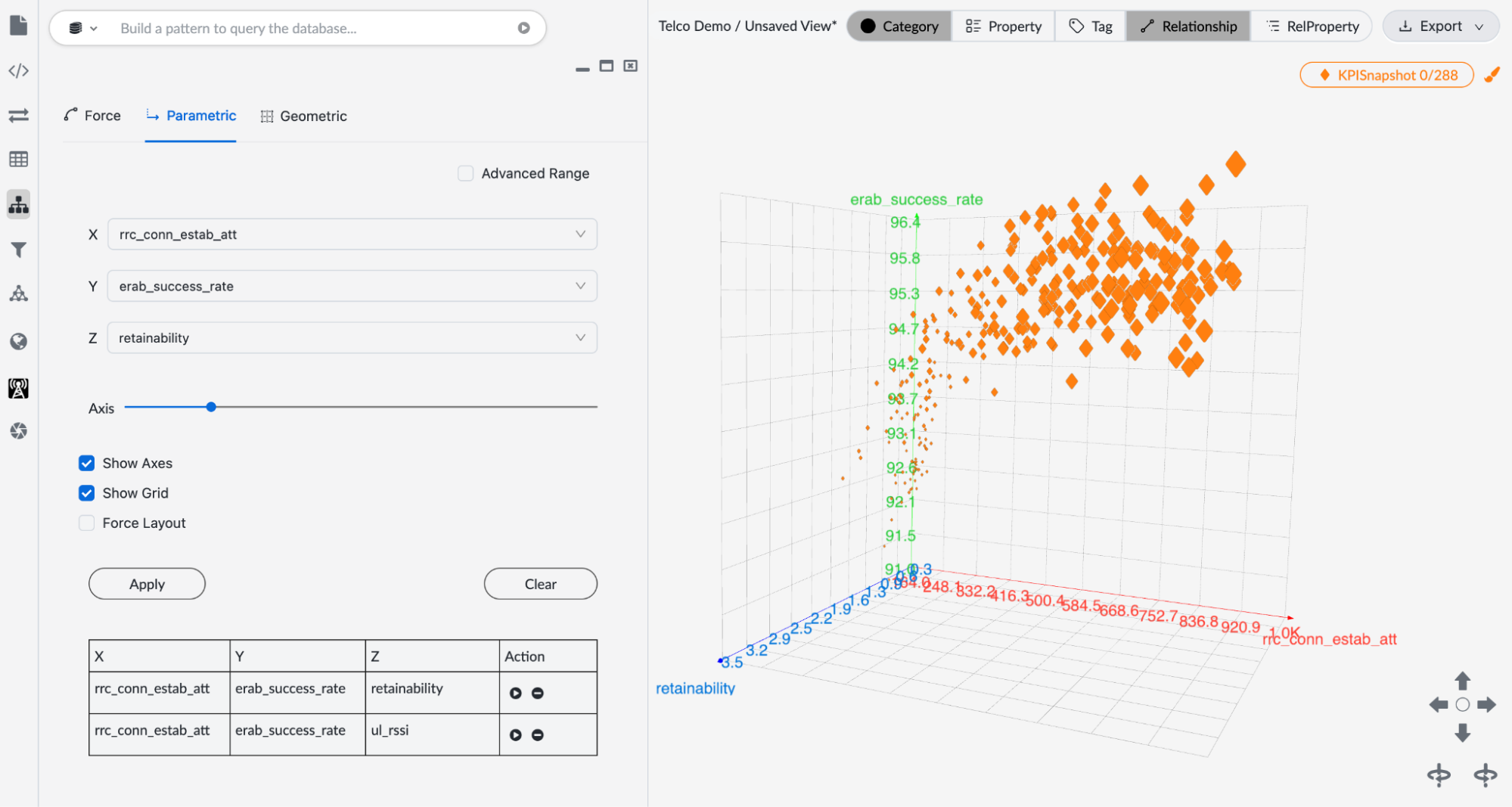
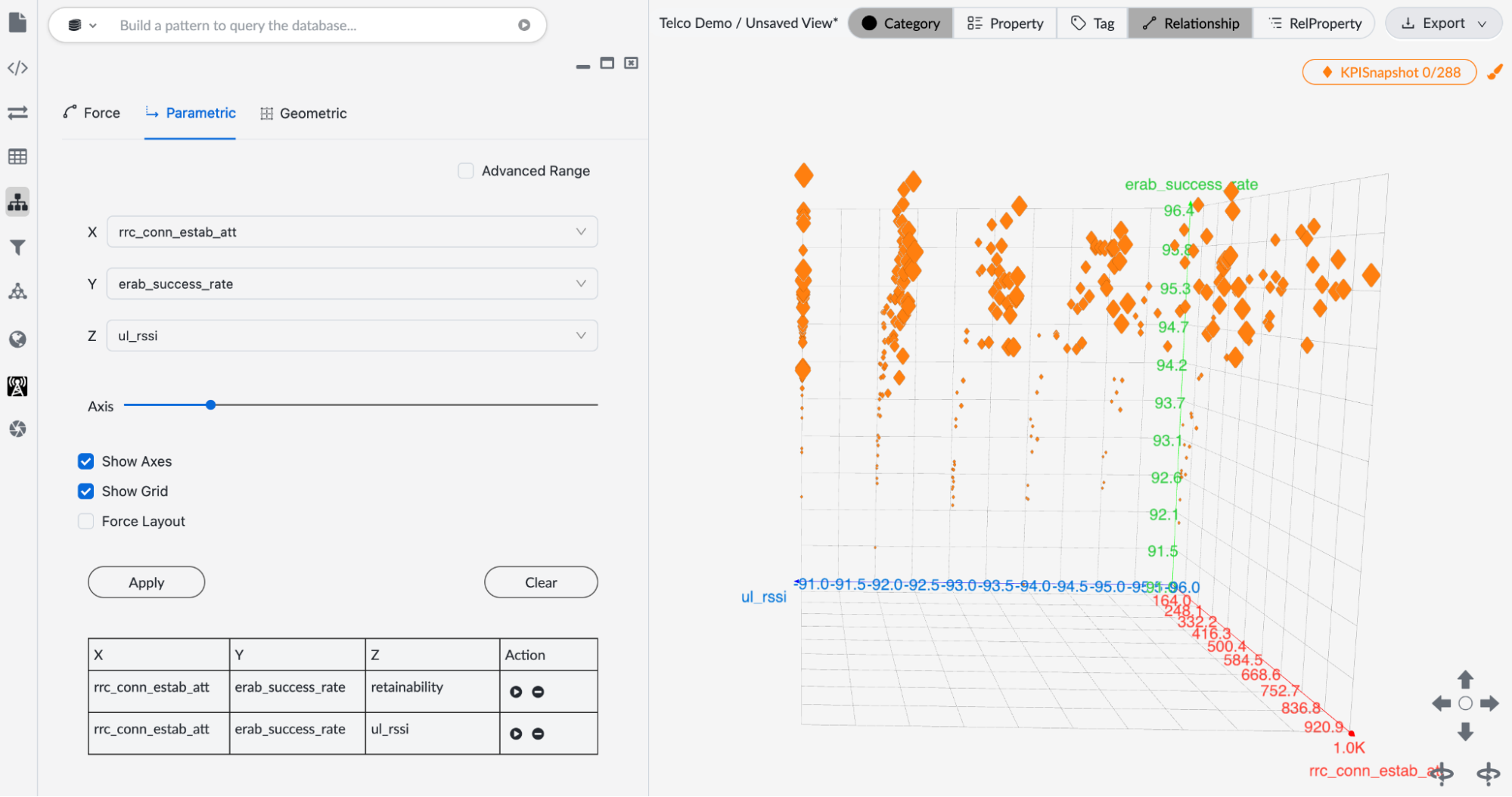
In GraphXR, we can plot success rate, retainability, and signal strength in a 3-dimensional parametric layout, again scaling node size according to traffic volume. This enables us to observe the correlations behind the failures hidden in multi-dimensional structure, as shown in the two examples below.
Correlation between traffic volume, success rate and retainability:
Correlation to signal strength:
Visualizing Failed Procedures and their Devices
Graph visualization made it much easier to spotlight and follow up on failed procedures.
A simple GQL query in GraphXR’s query window loads all the failed Procedures:
MATCH (p:Procedure) WHERE p.success = false RETURN p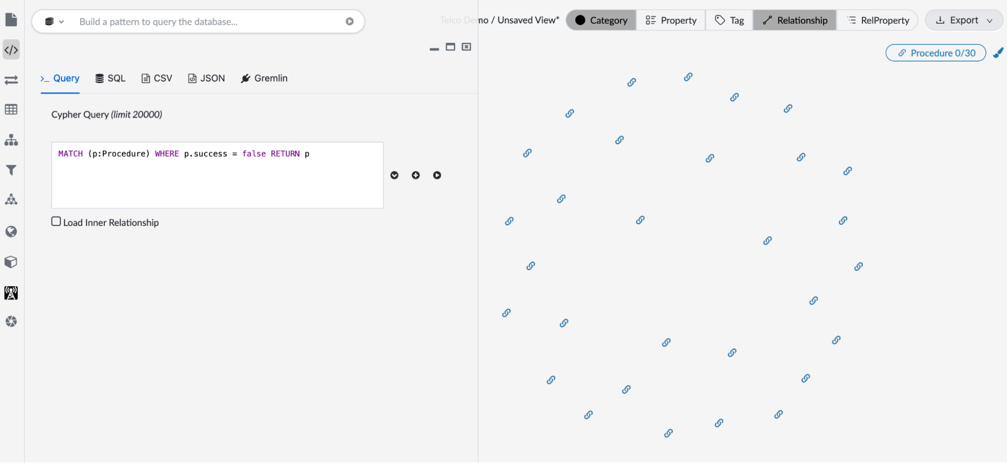
We then select the Procedures, right mouse click and Expand on the [:PERFORMS] relationship.
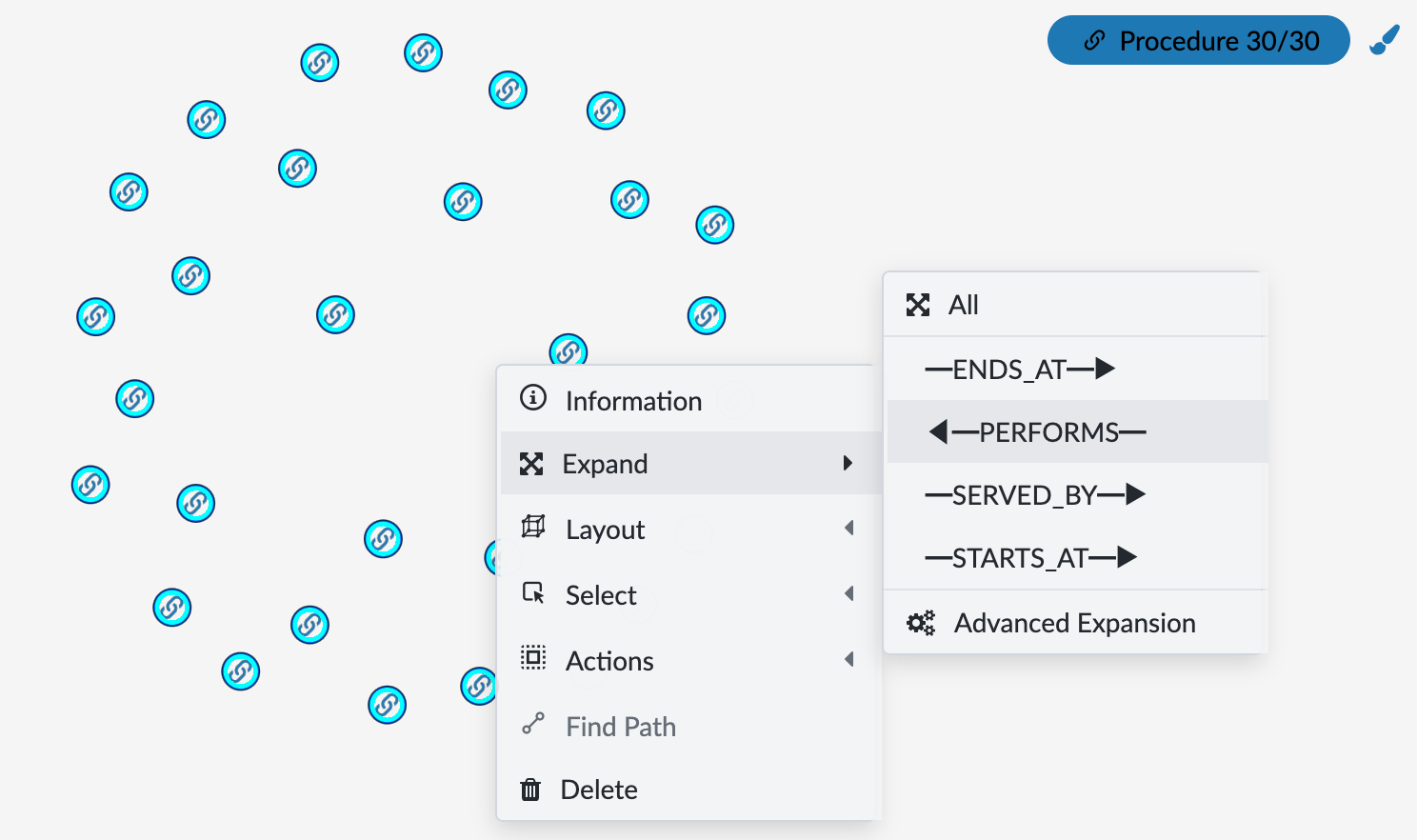
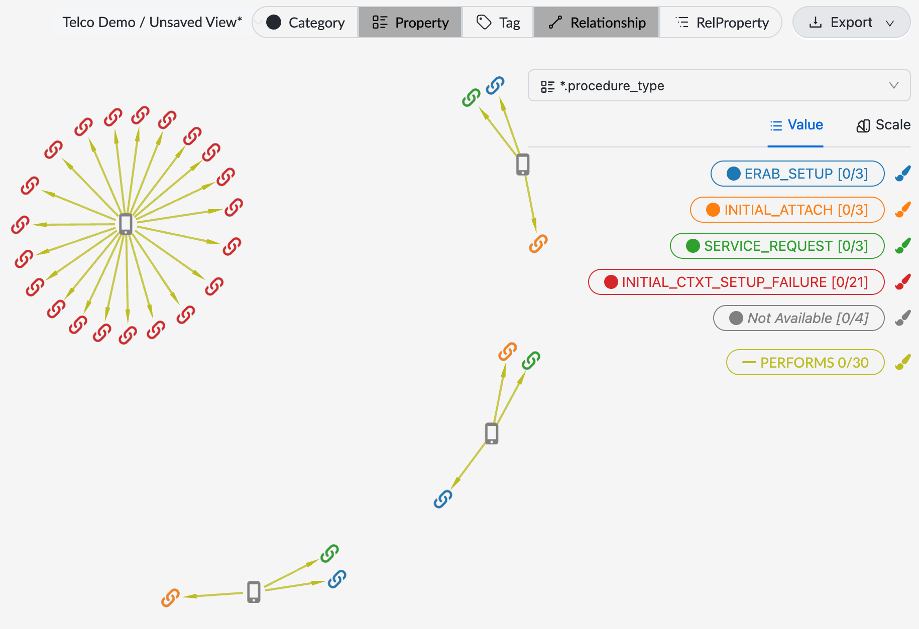
Now the graph shows which devices contributed to the failures. Coloring the devices by the procedure_type property value immediately reveals an interesting situation:
- One device accounted for all 21 INITIAL_CTXT_SETUP_FAILURE (security context setup) failures.
- Three other devices always failed together in the same three procedure types: ERAB_SETUP, INITIAL_ATTACH AND SERVICE_REQUEST, suggesting those three procedure types are related to the same root cause of the failure.
From investigation to ongoing operation
In GraphXR, when an analyst completes an investigation and highlights useful patterns, those insights can quickly be turned into a customized low-code Grovebook dashboard, as we show. With a Grovebook, users can run queries automatically and repeat data fetching, transformation, and layout steps.
This makes an investigative workflow accessible to field technicians and operations staff, since they would not need to know GQL or manage database queries directly. With SSO and role-based access controls, these dashboards can also be deployed safely across teams.
Getting started
- Google Cloud Marketplace: GraphXR Explorer for Spanner, self-service; listed as an official Spanner Graph visualization partner
- Source data and agent framework: Telco ANO data demo on GitHub
- Free trial: graphxr.kineviz.com with your own Spanner Graph endpoint
- Onboarding: kineviz.com/spannergraph for hands-on setup with the ANO dataset